
FROM STRATEGY TO IDENTITYThe Acupuncture Project
When Dr. Kevin Lyons approached Sattva Creative, he had a clear mission: to make acupuncture feel simple, accessible, and unintimidating.
The Acupuncture Project needed a brand that would feel as inviting to first-timers as it would to wellness veterans—a space that fosters connection, reflection, healing, and ease.
Our job was to translate that energy into every visual and verbal touchpoint.
LOCATION:
Asbury Park, New Jersey
KEY ELEMENTS:
Brand Strategy, Visual Identity, One-Page Website, Print Collateral, Signage
FOCUS:
Accessibility, calm design, and approachable branding
You’ll see how this came to life across print and digital touchpoints, including business cards, rack cards, patient intake forms, in-studio signage, and newspaper ads.
BRAND STRATEGY HIGHLIGHTS
Before any visuals are created, we begin by listening—deeply.
For The Acupuncture Project, that meant exploring what they stood for, who they serve, and how they want people to feel. Together, we uncovered their purpose, values, brand personality, and so much more to shape a calm, grounded, and welcoming identity.
It was about uncovering the essence beneath the surface, so the brand could express itself with clarity, confidence, and care.
This foundational work didn’t just inform the visuals and the messaging—it ensured that every brand element felt aligned, intentional, and true to the heart of the practice.
Brand Strategy included:
Brand purpose and positioning
Core values and guiding principles
Target audience definition
Brand personality and tone of voice
Mission, vision, and story elements
Brand moodboards and strategy boards
Color palette exploration
Strategic foundation for visual identity

A glimpse into the strategic foundation that informed the visuals, just a small part of what goes into building an aligned brand.
Brand Moodboard
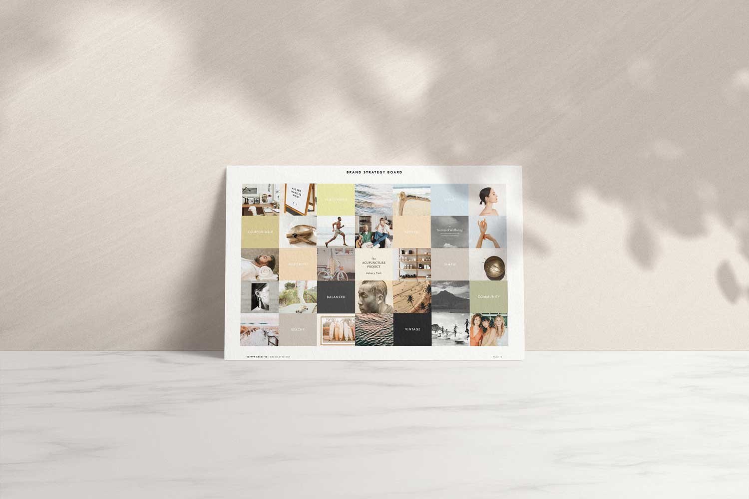
Brand Strategy Board

Brand Color Palette
VISUAL IDENTITY
Visual identity is where strategy begins to take shape — where intention becomes tangible.
The brand needed to be expressed across:
– Business cards
– In-studio signage
– Printed forms and collateral
– A one-page responsive website
This was just the beginning — a foundational visual system built to evolve alongside the business as it expands into new spaces and offerings.
With clarity and intention guiding every step, we translated APAP’s brand strategy into a calm, minimalist visual identity.
The goal was to create a look that felt clean, grounded, and approachable — something that would resonate with new clients while still honoring the depth of the practice. Soft neutrals, refined typography, and generous white space created a peaceful brand presence that invites trust without overwhelm.
Curated imagery was selected to reflect the brand’s grounded, serene tone—with a subtle editorial edge that brings depth and sophistication.

Brand Logo & Submark
THE ACUPUNCTURE PROJECT · ASBURY PARKA calming, inclusive brand built to demystify acupuncture and invite holistic healing.
⌄

Squarespace Responsive Website Design

Curated Imagery
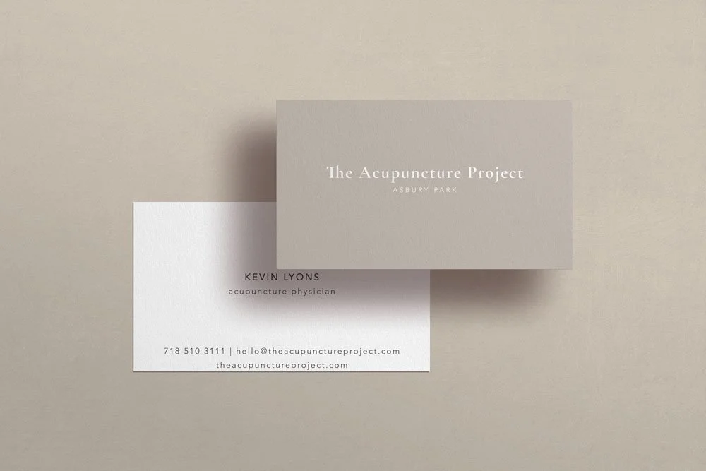
Business Cards

Sidewalk A-Frame Sign
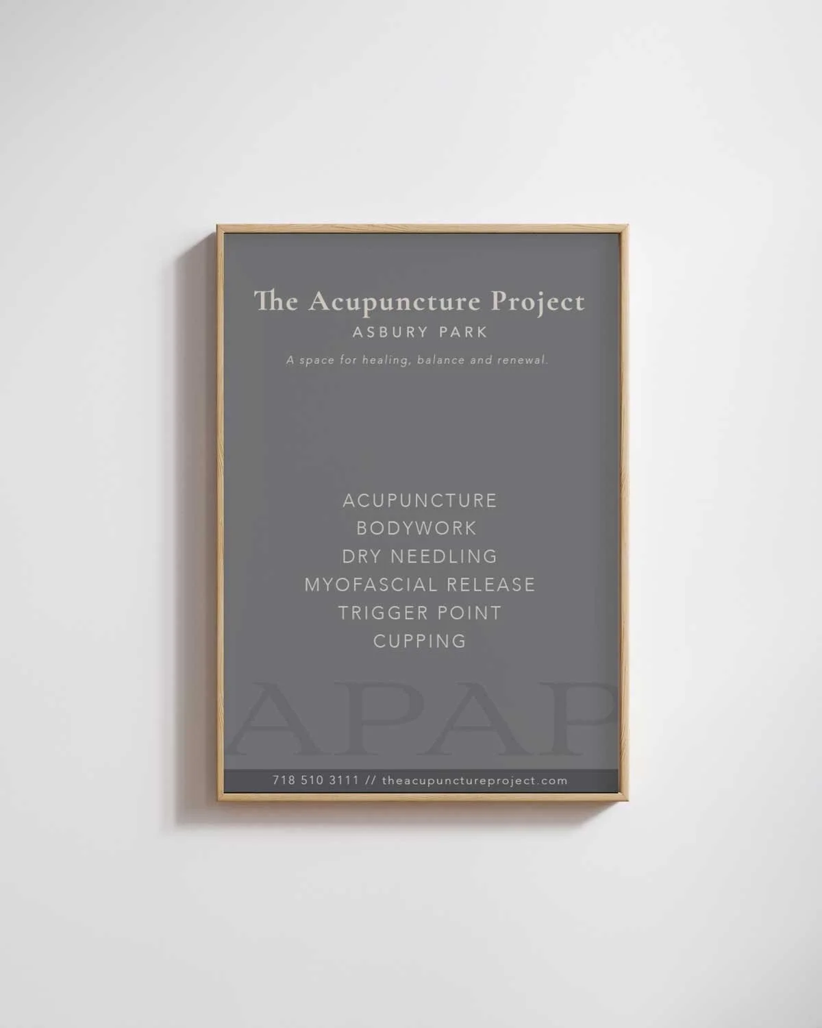
In-Studio Signage

Squarespace Responsive Website Design

Landing Page Design

Business Cards
BRINGING THE BRAND TO LIFE IN PRINT
Bringing a brand to life means thinking through every touchpoint — especially the ones clients physically interact with.
For APAP, we crafted a cohesive print suite that supported both outreach and the in-practice experience.
Deliverables included:
– A minimalist rack card designed for community visibility
– A full suite of branded patient intake forms
– A bold, large-scale newspaper ad
While the visual identity remained warm and approachable, we allowed space for moments of bold expression. The newspaper ad — inspired by traditional Chinese medicine — added an edgier, more evocative tone that nods to the practice’s depth and appeals to seasoned wellness seekers.

Branded Intake Forms
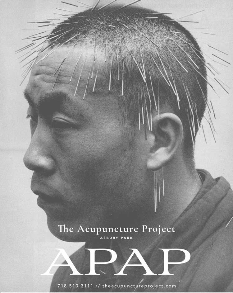
Newspaper Ad

Branded Custom Rack Card